浮动
大约 4 分钟约 1243 字
浮动可以让元素脱离标准文档流,指定一个元素应沿其容器的左侧或右侧放置,允许文本和内联元素环绕它。
开启浮动
浮动的基本语法 float: <keyword>。取值如下:
left:表明元素必须浮动在其所在的块容器左侧。right:表明元素必须浮动在其所在的块容器右侧。none:表明元素不进行浮动。inline-start:表明元素必须浮动在其所在块容器的开始一侧,在 ltr 脚本中是左侧,在 rtl 脚本中是右侧。inline-end:表明元素必须浮动在其所在块容器的结束一侧,在 ltr 脚本中是右侧,在 rtl 脚本中是左侧。
当一个元素浮动之后,它会被移出正常的文档流,然后向左或者向右平移,一直平移直到碰到了所处的容器的边框,或者碰到另外一个浮动的元素。
在下面的图片中,有三个红色的正方形。其中有两个向左浮动,一个向右浮动。要注意到第二个向左浮动的正方形被放在第一个向左浮动的正方形的右边。如果还有更多的正方形这样浮动,它们会继续向右堆放,直到填满容器一整行,之后换行至下一行。
浮动元素至少要与其最高的嵌套浮动子元素一样高。给父元素设置了 width: 600px,并将其设为浮动元素,以确保其高度足够包含其中的浮动子元素,并确保其宽度足以容纳这些元素。
浮动
<section>
  <div class="left">1</div>
  <div class="left">2</div>
  <div class="right">3</div>
  <p>
    Lorem ipsum dolor sit amet, consectetur adipiscing elit. Morbi tristique
    sapien ac erat tincidunt, sit amet dignissim lectus vulputate. Donec id
    iaculis velit. Aliquam vel malesuada erat. Praesent non magna ac massa
    aliquet tincidunt vel in massa. Phasellus feugiat est vel leo finibus
    congue.
  </p>
</section>
section {
  box-sizing: border-box;
  border: 1px solid blue;
  width: 600px;
  float: left;
}

div {
  margin: 5px;
  width: 50px;
  height: 150px;
}

.left {
  float: left;
  background: pink;
}

.right {
  float: right;
  background: cyan;
}
清除浮动
由于浮动会将元素移除标准文档流,因此浮动元素会影响上下文中的其他元素,所以必须要给浮动元素清除浮动。
浮动元素对其他元素的影响
<section>
  <div class="left">1</div>
  <div class="left">2</div>
  <div class="right">3</div>
  <p>
    Lorem ipsum dolor sit amet, consectetur adipiscing elit. Morbi tristique
    sapien ac erat tincidunt, sit amet dignissim lectus vulputate. Donec id
    iaculis velit. Aliquam vel malesuada erat. Praesent non magna ac massa
    aliquet tincidunt vel in massa. Phasellus feugiat est vel leo finibus
    congue.
  </p>
</section>
section {
  box-sizing: border-box;
  border: 1px solid blue;
  width: 600px;
  float: left;
}

div {
  margin: 5px;
  width: 50px;
  height: 50px;
}

.left {
  float: left;
  background: pink;
}

.right {
  float: right;
  background: cyan;
}
以下三种方法均可清除浮动。
/* 1、父级标签定义伪类 */
.clearfix::after {
  content: '';
  display: table;
  clear: both;
}
/* 兼容IE低版本 */
.clearfix {
  *zoom: 1;
}

/* 2、父级标签 overflow */
.clearfix {
  overflow: hidden;
}

/* 3、添加空 div 标签 */
.clearfix {
  clear: both;
}
第三种方式的 demo 如下,其余两种可以自行尝试。
添加空 div 标签清除浮动
<section>
  <div class="left">1</div>
  <div class="clearfix"></div>
  <div class="left">2</div>
  <div class="right">3</div>
  <p>
    Lorem ipsum dolor sit amet, consectetur adipiscing elit. Morbi tristique
    sapien ac erat tincidunt, sit amet dignissim lectus vulputate. Donec id
    iaculis velit. Aliquam vel malesuada erat. Praesent non magna ac massa
    aliquet tincidunt vel in massa. Phasellus feugiat est vel leo finibus
    congue.
  </p>
</section>
section {
  box-sizing: border-box;
  border: 1px solid blue;
  width: 600px;
  float: left;
}

div {
  margin: 5px;
  width: 50px;
  height: 50px;
}

.left {
  float: left;
  background: pink;
}

.right {
  float: right;
  background: cyan;
}

.clearfix {
  clear: both;
  width: 0;
  height: 0;
}
圣杯布局和双飞翼布局
提示
利用浮动可以实现两个经典布局。
作用
- 实现 pc 端三栏布局,中间一栏最先渲染
- 实现两边宽度固定,中间自适应
效果如下:
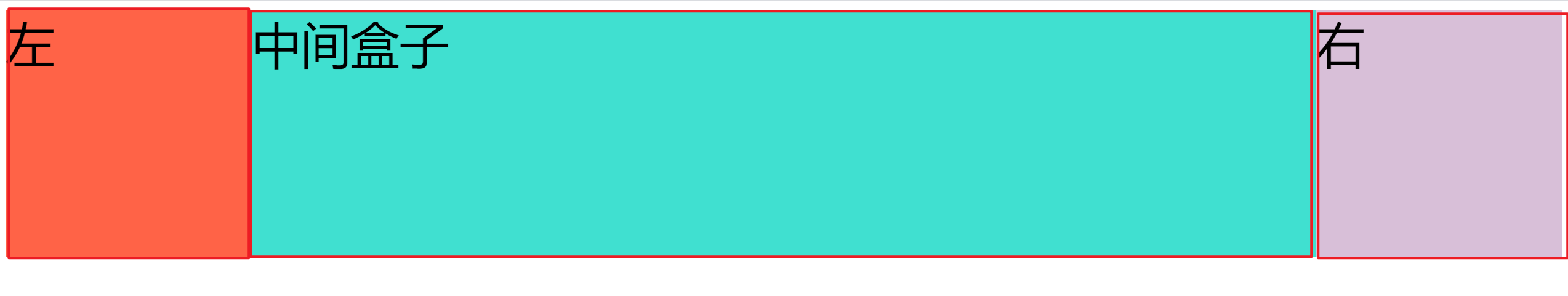
圣杯布局
圣杯布局
<div class="container clearfix">
  <div class="main float">中</div>
  <div class="left float">左</div>
  <div class="right float">右</div>
</div>
.container {
  padding: 0 200px;
  background-color: #eee;
}

/* 清除浮动 */
.clearfix::after {
  content: '';
  display: table;
  clear: both;
}

/* 关键 */
.float {
  float: left;
}

.main {
  width: 100%;
  height: 200px;
  background-color: #ccc;
}

.left {
  width: 200px;
  height: 200px;
  /* ---关键--- */
  position: relative;
  right: 200px;
  margin-left: -100%;
  /* ---关键--- */
  background-color: orange;
}

.right {
  width: 200px;
  height: 200px;
  /* ---关键--- */
  margin-right: -200px;
  /* ---关键--- */
  background-color: skyblue;
}
双飞翼布局
双飞翼布局
<div class="float wrapper">
  <div class="main">中</div>
</div>
<div class="left float">左</div>
<div class="right float">右</div>
/* 关键 */
.float {
  float: left;
}

.wrapper {
  width: 100%;
  height: 200px;
  background-color: #ccc;
}

/* 关键 */
.wrapper .main {
  height: 200px;
  margin-left: 200px;
  margin-right: 200px;
}

.left {
  width: 200px;
  height: 200px;
  /* 关键 */
  margin-left: -100%;
  background-color: orange;
}

.right {
  width: 200px;
  height: 200px;
  /* 关键 */
  margin-left: -200px;
  background-color: skyblue;
}
对比
| 圣杯布局 | 双飞翼布局 | |
|---|---|---|
| HTML | 包裹三栏 | 只包裹中间一栏 |
| 是否定位 | 相对定位 | 无需定位 |
| 左右栏的空间 | 使用 padding 预留 | 使用 margin 预留 |
| 左栏处理 | positon + margin-left | margin-left |
| 右栏处理 | margin-right | margin-left |