响应式设计
概念
- 响应式网页设计可让网页在所有设备上都美观大方。
- 响应式网页设计只使用 HTML 和 CSS。
- 响应式网页设计不是一个程序或 JavaScript。
网页可以通过多种不同设备浏览:台式电脑、平板电脑和手机。无论使用何种设备,您的网页都应美观大方,易于使用。
网页不应为了适应较小的设备而遗漏信息,而应调整内容以适应任何设备:

如果使用 CSS 和 HTML 来调整、隐藏、缩小、放大或移动内容,使其在任何屏幕上看起来都很美观,这就是所谓的响应式网页设计。
* {
  box-sizing: border-box;
}

.row::after {
  content: '';
  clear: both;
  display: table;
}

[class*='col-'] {
  float: left;
  padding: 15px;
}

html {
  font-family: 'Lucida Sans', sans-serif;
}

.header {
  background-color: #9933cc;
  color: #ffffff;
  padding: 15px;
}

.menu ul {
  list-style-type: none;
  margin: 0;
  padding: 0;
}

.menu li {
  padding: 8px;
  margin-bottom: 7px;
  background-color: #33b5e5;
  color: #ffffff;
  box-shadow: 0 1px 3px rgba(0, 0, 0, 0.12), 0 1px 2px rgba(0, 0, 0, 0.24);
}

.menu li:hover {
  background-color: #0099cc;
}

.aside {
  background-color: #33b5e5;
  padding: 15px;
  color: #ffffff;
  text-align: center;
  font-size: 14px;
  box-shadow: 0 1px 3px rgba(0, 0, 0, 0.12), 0 1px 2px rgba(0, 0, 0, 0.24);
}

.footer {
  background-color: #0099cc;
  color: #ffffff;
  text-align: center;
  font-size: 12px;
  padding: 15px;
}

/* For mobile phones: */
[class*='col-'] {
  width: 100%;
}

@media only screen and (min-width: 600px) {
  /* For tablets: */
  .col-s-1 {
    width: 8.33%;
  }
  .col-s-2 {
    width: 16.66%;
  }
  .col-s-3 {
    width: 25%;
  }
  .col-s-4 {
    width: 33.33%;
  }
  .col-s-5 {
    width: 41.66%;
  }
  .col-s-6 {
    width: 50%;
  }
  .col-s-7 {
    width: 58.33%;
  }
  .col-s-8 {
    width: 66.66%;
  }
  .col-s-9 {
    width: 75%;
  }
  .col-s-10 {
    width: 83.33%;
  }
  .col-s-11 {
    width: 91.66%;
  }
  .col-s-12 {
    width: 100%;
  }
}
@media only screen and (min-width: 768px) {
  /* For desktop: */
  .col-1 {
    width: 8.33%;
  }
  .col-2 {
    width: 16.66%;
  }
  .col-3 {
    width: 25%;
  }
  .col-4 {
    width: 33.33%;
  }
  .col-5 {
    width: 41.66%;
  }
  .col-6 {
    width: 50%;
  }
  .col-7 {
    width: 58.33%;
  }
  .col-8 {
    width: 66.66%;
  }
  .col-9 {
    width: 75%;
  }
  .col-10 {
    width: 83.33%;
  }
  .col-11 {
    width: 91.66%;
  }
  .col-12 {
    width: 100%;
  }
}
<div class="header">
  <h1>Chania</h1>
</div>

<div class="row">
  <div class="col-3 col-s-3 menu">
    <ul>
      <li>The Flight</li>
      <li>The City</li>
      <li>The Island</li>
      <li>The Food</li>
    </ul>
  </div>

  <div class="col-6 col-s-9">
    <h1>The City</h1>
    <p>
      Chania is the capital of the Chania region on the island of Crete. The
      city can be divided in two parts, the old town and the modern city.
    </p>
  </div>

  <div class="col-3 col-s-12">
    <div class="aside">
      <h2>What?</h2>
      <p>Chania is a city on the island of Crete.</p>
      <h2>Where?</h2>
      <p>Crete is a Greek island in the Mediterranean Sea.</p>
      <h2>How?</h2>
      <p>You can reach Chania airport from all over Europe.</p>
    </div>
  </div>
</div>

<div class="footer">
  <p>
    Resize the browser window to see how the content respond to the resizing.
  </p>
</div>
接下来会逐步介绍相关概念并实现这个例子。
视口 viewport
概念
视口是用户在网页上的可见区域。
视口因设备而异,手机上的视口会比电脑屏幕上的小。
在平板电脑和手机出现之前,网页只针对电脑屏幕设计,网页通常采用静态设计和固定尺寸。
后来,当我们开始使用平板电脑和手机上网时,固定尺寸的网页太大,无法适应视口。为了解决这个问题,这些设备上的浏览器缩小了整个网页以适应屏幕。
设置视口
HTML5 引入了一种方法,让网页设计师通过 <meta> 标签来控制视口。
应在所有网页中包含以下 <meta> 视口元素:
<meta name="viewport" content="width=device-width, initial-scale=1.0" />
这就为浏览器提供了如何控制页面尺寸和缩放比例的说明。
width=device-width 部分将页面宽度设置为设备的屏幕宽度(因设备而异)。
initial-scale=1.0 部分设置浏览器首次加载页面时的初始缩放级别。
下面是一个未使用视口 <meta> 标签的网页和使用视口 <meta> 标签的网页的示例:
根据视口调整内容大小
用户习惯在台式机和移动设备上垂直滚动网站,但不习惯水平滚动!
因此,如果用户被迫水平滚动或缩放才能看到整个网页,就会造成糟糕的用户体验。
需要遵循的其他一些规则:
- 切勿使用固定宽度的大型元素 —— 例如,如果显示的图片宽度大于视口宽度,就会导致视口水平滚动。切记调整这些内容,使其适合视口宽度。
- 不要让内容依赖特定的视口宽度来呈现 —— 由于不同设备的屏幕尺寸和 CSS 像素宽度差异很大,因此内容不应依赖特定的视口宽度来呈现。
- 使用 CSS 媒体查询为大屏幕和小屏幕应用不同的样式 —— 为页面元素设置较大的绝对 CSS 宽度会导致元素对于较小设备的视口来说过宽。取而代之的是,考虑使用相对宽度值,如 width: 100%。此外,使用较大的绝对定位值也要小心。它可能会导致元素在小型设备上超出视口。
网格
概念
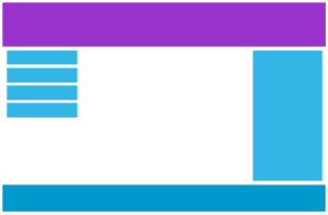
许多网页都采用网格视图,即把网页分成几列:
在设计网页时,使用网格视图非常有帮助。它能让你更轻松地在页面上放置元素。
响应式网格视图通常有 12 列,总宽度为 100%,会随着浏览器窗口大小的调整而缩小或展开。
建立响应式网格视图
首先确保所有 HTML 元素的框大小属性都设置为 border-box。这样就能确保元素的总宽度和高度中包含 padding 和 border。
在 CSS 中添加以下代码:
* {
  box-sizing: border-box;;
}
有关 box-sizing 属性的更多信息,请参阅 盒模型。
下面的示例展示了一个简单的响应式网页,有两列:
<!DOCTYPE html>
<html>
  <head>
    <meta name="viewport" content="width=device-width, initial-scale=1.0" />
    <style>
      * {
        box-sizing: border-box;
      }

      .header {
        border: 1px solid red;
        padding: 15px;
      }

      .menu {
        width: 25%;
        float: left;
        padding: 15px;
        border: 1px solid red;
      }

      .main {
        width: 75%;
        float: left;
        padding: 15px;
        border: 1px solid red;
      }
    </style>
  </head>
  <body>
    <div class="header">
      <h1>Chania</h1>
    </div>

    <div class="menu">
      <ul>
        <li>The Flight</li>
        <li>The City</li>
        <li>The Island</li>
        <li>The Food</li>
      </ul>
    </div>

    <div class="main">
      <h1>The City</h1>
      <p>
        Chania is the capital of the Chania region on the island of Crete. The
        city can be divided in two parts, the old town and the modern city.
      </p>
      <p>
        Resize the browser window to see how the content respond to the
        resizing.
      </p>
    </div>
  </body>
</html>
如果网页只包含两列,上面的示例就没问题。
但是,我们希望使用有 12 列的响应式网格视图,以便对网页有更多的控制。
首先,我们必须计算一列的百分比:100% / 12 列 = 8.33%。
然后,我们为 12 列中的每一列创建一个类,class="col-",并用一个数字定义该部分应跨越多少列:
.col-1 {
  width: 8.33%;
}
.col-2 {
  width: 16.66%;
}
.col-3 {
  width: 25%;
}
.col-4 {
  width: 33.33%;
}
.col-5 {
  width: 41.66%;
}
.col-6 {
  width: 50%;
}
.col-7 {
  width: 58.33%;
}
.col-8 {
  width: 66.66%;
}
.col-9 {
  width: 75%;
}
.col-10 {
  width: 83.33%;
}
.col-11 {
  width: 91.66%;
}
.col-12 {
  width: 100%;
}
所有这些列都应向左浮动,并有 15px 的边距:
[class*='col-'] {
  float: left;
  padding: 15px;
  border: 1px solid red;
}
每一行都应包裹在 <div> 中。一行内的列数相加应为 12:
<div class="row">
  <div class="col-3">...</div>
  <!-- 25% -->
  <div class="col-9">...</div>
  <!-- 75% -->
</div>
行内的列都会向左浮动,因此会脱离页面的流程,其他元素的放置就好像这些列不存在一样。为了避免这种情况,添加一种样式来 清除页面浮动:
.row::after {
  content: '';
  clear: both;
  display: table;
}
最后添加一些样式:
<!DOCTYPE html>
<html>
  <head>
    <meta name="viewport" content="width=device-width, initial-scale=1.0" />
    <style>
      * {
        box-sizing: border-box;
      }

      .row::after {
        content: '';
        clear: both;
        display: table;
      }

      [class*='col-'] {
        float: left;
        padding: 15px;
      }

      .col-1 {
        width: 8.33%;
      }
      .col-2 {
        width: 16.66%;
      }
      .col-3 {
        width: 25%;
      }
      .col-4 {
        width: 33.33%;
      }
      .col-5 {
        width: 41.66%;
      }
      .col-6 {
        width: 50%;
      }
      .col-7 {
        width: 58.33%;
      }
      .col-8 {
        width: 66.66%;
      }
      .col-9 {
        width: 75%;
      }
      .col-10 {
        width: 83.33%;
      }
      .col-11 {
        width: 91.66%;
      }
      .col-12 {
        width: 100%;
      }

      html {
        font-family: 'Lucida Sans', sans-serif;
      }

      .header {
        background-color: #9933cc;
        color: #ffffff;
        padding: 15px;
      }

      .menu ul {
        list-style-type: none;
        margin: 0;
        padding: 0;
      }

      .menu li {
        padding: 8px;
        margin-bottom: 7px;
        background-color: #33b5e5;
        color: #ffffff;
        box-shadow: 0 1px 3px rgba(0, 0, 0, 0.12), 0 1px 2px rgba(0, 0, 0, 0.24);
      }

      .menu li:hover {
        background-color: #0099cc;
      }
    </style>
  </head>
  <body>
    <div class="header">
      <h1>Chania</h1>
    </div>

    <div class="row">
      <div class="col-3 menu">
        <ul>
          <li>The Flight</li>
          <li>The City</li>
          <li>The Island</li>
          <li>The Food</li>
        </ul>
      </div>

      <div class="col-9">
        <h1>The City</h1>
        <p>
          Chania is the capital of the Chania region on the island of Crete. The
          city can be divided in two parts, the old town and the modern city.
        </p>
        <p>
          Resize the browser window to see how the content respond to the
          resizing.
        </p>
      </div>
    </div>
  </body>
</html>
注意
将浏览器窗口调整到非常小的宽度时,示例中的网页看起来并不好。在下一章中,你将学习如何解决这个问题。
媒体查询
概念
媒体查询是 CSS3 中引入的一种 CSS 技术。
它使用 @media 规则,只有在特定条件为真的情况下才会包含 CSS 属性块。
<!DOCTYPE html>
<html>
  <head>
    <meta name="viewport" content="width=device-width, initial-scale=1.0" />
    <style>
      p {
        color: lightgreen;
      }

      @media only screen and (max-width: 800px) {
        p {
          color: lightblue;
        }
      }
    </style>
  </head>
  <body>
    <p>
      Resize the browser window. When the width of this document is 800 pixels
      or less, the color is "lightblue", otherwise it is "lightgreen".
    </p>
  </body>
</html>
添加手机断点
前面制作了一个有行和列的网页,它是响应式的,但在小屏幕上看起来并不好。
媒体查询可以帮助我们解决这个问题。我们可以添加一个断点,在断点两侧,设计的某些部分会有不同的表现。

使用媒体查询在 768px 处添加断点:
当屏幕(浏览器窗口)小于 768px 时,每列的宽度应为 100%:
/* For desktop: */
.col-1 {
  width: 8.33%;
}
.col-2 {
  width: 16.66%;
}
.col-3 {
  width: 25%;
}
.col-4 {
  width: 33.33%;
}
.col-5 {
  width: 41.66%;
}
.col-6 {
  width: 50%;
}
.col-7 {
  width: 58.33%;
}
.col-8 {
  width: 66.66%;
}
.col-9 {
  width: 75%;
}
.col-10 {
  width: 83.33%;
}
.col-11 {
  width: 91.66%;
}
.col-12 {
  width: 100%;
}

@media only screen and (max-width: 768px) {
  /* For mobile phones: */
  [class*='col-'] {
    width: 100%;
  }
}
<!DOCTYPE html>
<html>
  <head>
    <meta name="viewport" content="width=device-width, initial-scale=1.0" />
    <style>
      * {
        box-sizing: border-box;
      }

      .row::after {
        content: '';
        clear: both;
        display: block;
      }

      [class*='col-'] {
        float: left;
        padding: 15px;
      }

      html {
        font-family: 'Lucida Sans', sans-serif;
      }

      .header {
        background-color: #9933cc;
        color: #ffffff;
        padding: 15px;
      }

      .menu ul {
        list-style-type: none;
        margin: 0;
        padding: 0;
      }

      .menu li {
        padding: 8px;
        margin-bottom: 7px;
        background-color: #33b5e5;
        color: #ffffff;
        box-shadow: 0 1px 3px rgba(0, 0, 0, 0.12), 0 1px 2px rgba(0, 0, 0, 0.24);
      }

      .menu li:hover {
        background-color: #0099cc;
      }

      .aside {
        background-color: #33b5e5;
        padding: 15px;
        color: #ffffff;
        text-align: center;
        font-size: 14px;
        box-shadow: 0 1px 3px rgba(0, 0, 0, 0.12), 0 1px 2px rgba(0, 0, 0, 0.24);
      }

      .footer {
        background-color: #0099cc;
        color: #ffffff;
        text-align: center;
        font-size: 12px;
        padding: 15px;
      }

      /* For desktop: */
      .col-1 {
        width: 8.33%;
      }
      .col-2 {
        width: 16.66%;
      }
      .col-3 {
        width: 25%;
      }
      .col-4 {
        width: 33.33%;
      }
      .col-5 {
        width: 41.66%;
      }
      .col-6 {
        width: 50%;
      }
      .col-7 {
        width: 58.33%;
      }
      .col-8 {
        width: 66.66%;
      }
      .col-9 {
        width: 75%;
      }
      .col-10 {
        width: 83.33%;
      }
      .col-11 {
        width: 91.66%;
      }
      .col-12 {
        width: 100%;
      }

      @media only screen and (max-width: 768px) {
        /* For mobile phones: */
        [class*='col-'] {
          width: 100%;
        }
      }
    </style>
  </head>
  <body>
    <div class="header">
      <h1>Chania</h1>
    </div>

    <div class="row">
      <div class="col-3 menu">
        <ul>
          <li>The Flight</li>
          <li>The City</li>
          <li>The Island</li>
          <li>The Food</li>
        </ul>
      </div>

      <div class="col-6">
        <h1>The City</h1>
        <p>
          Chania is the capital of the Chania region on the island of Crete. The
          city can be divided in two parts, the old town and the modern city.
        </p>
      </div>

      <div class="col-3 right">
        <div class="aside">
          <h2>What?</h2>
          <p>Chania is a city on the island of Crete.</p>
          <h2>Where?</h2>
          <p>Crete is a Greek island in the Mediterranean Sea.</p>
          <h2>How?</h2>
          <p>You can reach Chania airport from all over Europe.</p>
        </div>
      </div>
    </div>

    <div class="footer">
      <p>
        Resize the browser window to see how the content respond to the
        resizing.
      </p>
    </div>
  </body>
</html>
始终坚持移动端优先的设计理念
移动优先是指在为台式机或其他设备设计之前,先为移动设备设计(这将使页面在较小的设备上显示更快)。
这意味着我们必须对 CSS 进行一些修改。
我们不应在宽度小于 768px 时更改样式,而应在宽度大于 768px 时更改设计。这将使我们的设计成为 「移动端优先」:
/* For mobile phones: */
[class*='col-'] {
  width: 100%;
}

@media only screen and (min-width: 768px) {
  /* For desktop: */
  .col-1 {
    width: 8.33%;
  }
  .col-2 {
    width: 16.66%;
  }
  .col-3 {
    width: 25%;
  }
  .col-4 {
    width: 33.33%;
  }
  .col-5 {
    width: 41.66%;
  }
  .col-6 {
    width: 50%;
  }
  .col-7 {
    width: 58.33%;
  }
  .col-8 {
    width: 66.66%;
  }
  .col-9 {
    width: 75%;
  }
  .col-10 {
    width: 83.33%;
  }
  .col-11 {
    width: 91.66%;
  }
  .col-12 {
    width: 100%;
  }
}
添加平板电脑断点
我们可以随意添加断点。
我们还将在平板电脑和手机之间插入一个断点。
为此,我们增加了一个媒体查询(600px),并为大于 600px(但小于 768px)的设备增加了一组新的类:
/* For mobile phones: */
[class*='col-'] {
  width: 100%;
}

@media only screen and (min-width: 600px) {
  /* For tablets: */
  .col-s-1 {
    width: 8.33%;
  }
  .col-s-2 {
    width: 16.66%;
  }
  .col-s-3 {
    width: 25%;
  }
  .col-s-4 {
    width: 33.33%;
  }
  .col-s-5 {
    width: 41.66%;
  }
  .col-s-6 {
    width: 50%;
  }
  .col-s-7 {
    width: 58.33%;
  }
  .col-s-8 {
    width: 66.66%;
  }
  .col-s-9 {
    width: 75%;
  }
  .col-s-10 {
    width: 83.33%;
  }
  .col-s-11 {
    width: 91.66%;
  }
  .col-s-12 {
    width: 100%;
  }
}

@media only screen and (min-width: 768px) {
  /* For desktop: */
  .col-1 {
    width: 8.33%;
  }
  .col-2 {
    width: 16.66%;
  }
  .col-3 {
    width: 25%;
  }
  .col-4 {
    width: 33.33%;
  }
  .col-5 {
    width: 41.66%;
  }
  .col-6 {
    width: 50%;
  }
  .col-7 {
    width: 58.33%;
  }
  .col-8 {
    width: 66.66%;
  }
  .col-9 {
    width: 75%;
  }
  .col-10 {
    width: 83.33%;
  }
  .col-11 {
    width: 91.66%;
  }
  .col-12 {
    width: 100%;
  }
}
我们有两组完全相同的类,这似乎有点奇怪,但这给了我们在 HTML 中决定在每个断点处如何处理列的机会:
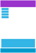
提示
用于电脑:
第一部分和第三部分各占 3 列。中间部分将横跨 6 列。
平板电脑:
第一部分跨 3 列,第二部分跨 9 列,第三部分显示在前两个部分的下方,跨 12 列:
<!DOCTYPE html>
<html>
  <head>
    <meta name="viewport" content="width=device-width, initial-scale=1.0" />
    <style>
      * {
        box-sizing: border-box;
      }

      .row::after {
        content: '';
        clear: both;
        display: table;
      }

      [class*='col-'] {
        float: left;
        padding: 15px;
      }

      html {
        font-family: 'Lucida Sans', sans-serif;
      }

      .header {
        background-color: #9933cc;
        color: #ffffff;
        padding: 15px;
      }

      .menu ul {
        list-style-type: none;
        margin: 0;
        padding: 0;
      }

      .menu li {
        padding: 8px;
        margin-bottom: 7px;
        background-color: #33b5e5;
        color: #ffffff;
        box-shadow: 0 1px 3px rgba(0, 0, 0, 0.12), 0 1px 2px rgba(0, 0, 0, 0.24);
      }

      .menu li:hover {
        background-color: #0099cc;
      }

      .aside {
        background-color: #33b5e5;
        padding: 15px;
        color: #ffffff;
        text-align: center;
        font-size: 14px;
        box-shadow: 0 1px 3px rgba(0, 0, 0, 0.12), 0 1px 2px rgba(0, 0, 0, 0.24);
      }

      .footer {
        background-color: #0099cc;
        color: #ffffff;
        text-align: center;
        font-size: 12px;
        padding: 15px;
      }

      /* For mobile phones: */
      [class*='col-'] {
        width: 100%;
      }

      @media only screen and (min-width: 600px) {
        /* For tablets: */
        .col-s-1 {
          width: 8.33%;
        }
        .col-s-2 {
          width: 16.66%;
        }
        .col-s-3 {
          width: 25%;
        }
        .col-s-4 {
          width: 33.33%;
        }
        .col-s-5 {
          width: 41.66%;
        }
        .col-s-6 {
          width: 50%;
        }
        .col-s-7 {
          width: 58.33%;
        }
        .col-s-8 {
          width: 66.66%;
        }
        .col-s-9 {
          width: 75%;
        }
        .col-s-10 {
          width: 83.33%;
        }
        .col-s-11 {
          width: 91.66%;
        }
        .col-s-12 {
          width: 100%;
        }
      }
      @media only screen and (min-width: 768px) {
        /* For desktop: */
        .col-1 {
          width: 8.33%;
        }
        .col-2 {
          width: 16.66%;
        }
        .col-3 {
          width: 25%;
        }
        .col-4 {
          width: 33.33%;
        }
        .col-5 {
          width: 41.66%;
        }
        .col-6 {
          width: 50%;
        }
        .col-7 {
          width: 58.33%;
        }
        .col-8 {
          width: 66.66%;
        }
        .col-9 {
          width: 75%;
        }
        .col-10 {
          width: 83.33%;
        }
        .col-11 {
          width: 91.66%;
        }
        .col-12 {
          width: 100%;
        }
      }
    </style>
  </head>
  <body>
    <div class="header">
      <h1>Chania</h1>
    </div>

    <div class="row">
      <div class="col-3 col-s-3 menu">
        <ul>
          <li>The Flight</li>
          <li>The City</li>
          <li>The Island</li>
          <li>The Food</li>
        </ul>
      </div>

      <div class="col-6 col-s-9">
        <h1>The City</h1>
        <p>
          Chania is the capital of the Chania region on the island of Crete. The
          city can be divided in two parts, the old town and the modern city.
        </p>
      </div>

      <div class="col-3 col-s-12">
        <div class="aside">
          <h2>What?</h2>
          <p>Chania is a city on the island of Crete.</p>
          <h2>Where?</h2>
          <p>Crete is a Greek island in the Mediterranean Sea.</p>
          <h2>How?</h2>
          <p>You can reach Chania airport from all over Europe.</p>
        </div>
      </div>
    </div>

    <div class="footer">
      <p>
        Resize the browser window to see how the content respond to the
        resizing.
      </p>
    </div>
  </body>
</html>
典型设备断点
屏幕和设备的高度和宽度各不相同,因此很难为每种设备创建精确的断点。为了简单起见,可以将目标锁定为五组:
/* Extra small devices (phones, 600px and down) */
@media only screen and (max-width: 600px) {
  ...;
}

/* Small devices (portrait tablets and large phones, 600px and up) */
@media only screen and (min-width: 600px) {
  ...;
}

/* Medium devices (landscape tablets, 768px and up) */
@media only screen and (min-width: 768px) {
  ...;
}

/* Large devices (laptops/desktops, 992px and up) */
@media only screen and (min-width: 992px) {
  ...;
}

/* Extra large devices (large laptops and desktops, 1200px and up) */
@media only screen and (min-width: 1200px) {
  ...;
}
方向纵向/横向
媒体查询还可用于根据浏览器的方向改变页面布局。
您可以设置一组 CSS 属性,只有当浏览器窗口的宽度大于高度(即所谓的「横向」方向)时才适用:
@media only screen and (orientation: landscape) {
  body {
    background-color: lightblue;
  }
}
使用媒体查询隐藏元素
媒体查询的另一个常见用途是在不同尺寸的屏幕上隐藏元素:
/* If the screen size is 600px wide or less, hide the element */
@media only screen and (max-width: 600px) {
  div.example {
    display: none;
  }
}
<!DOCTYPE html>
<html>
  <head>
    <meta name="viewport" content="width=device-width, initial-scale=1" />
    <style>
      div.example {
        background-color: yellow;
        padding: 20px;
      }

      @media screen and (max-width: 600px) {
        div.example {
          display: none;
        }
      }
    </style>
  </head>
  <body>
    <h2>Hide elements on different screen sizes</h2>

    <div class="example">Example DIV.</div>

    <p>
      When the browser's width is 600px wide or less, hide the div element.
      Resize the browser window to see the effect.
    </p>
  </body>
</html>
提示
实际上可以使用这实现侧边栏。
屏幕宽度小于 900px 时显示菜单按钮,并隐藏菜单项。
.menu-content.active {
  transform: translateX(0);
}

@media only screen and (max-width: 900px) {
  .menu-content {
    z-index: 125;
    box-shadow: none;
    transform: translateX(-100%);
  }
}

.menu-button {
  display: none;
}

@media only screen and (max-width: 900px) {
  .menu-button {
    display: block;
  }
}
<div class="nav">
  <button class="menu-button" onclick="this.classList.toggle('active')">
    <span class="icon"></span>
  </button>
  <div>顶部菜单</div>
</div>
<div class="menu-content">
  <ul>
    <li>菜单项1</li>
    <li>菜单项2</li>
    <li>菜单项3</li>
  </ul>
</div>
<div class="content"></div>
.nav {
  display: flex;
  /* justify-content: center; */
  align-items: center;
}

/* 基本样式 */
.menu-button {
  display: block;
  cursor: pointer;
  position: relative;
  color: #fff;
  background: transparent;
  font-size: 18px;
  border: none;
  outline: none;
  width: 40px;
  height: 40px;
}

.menu-button .icon {
  margin: 0.4em 0;
}

/* 菜单按钮的三条线 */
.menu-button .icon,
.menu-button::before,
.menu-button::after {
  display: block;
  width: 100%;
  height: 2px;
  border-radius: 0.05em;
  background: var(--dark-grey);
  transition: transform 0.2s ease-in-out;
}

/* 上面的线 */
.menu-button::before {
  content: '';
  margin-top: 0.125em;
}

/* 中间的线 */
.menu-button::after {
  content: '';
  margin-bottom: 0.125em;
}

/* 按钮展开时,将上下线转换为叉叉 */
.menu-button.active::before {
  transform: translateY(0.55rem) rotate(135deg);
}

.menu-button.active::after {
  transform: translateY(-0.55rem) rotate(-135deg);
}

/* 按钮展开时,隐藏中间线 */
.menu-button.active .icon {
  transform: scale(0);
}

/* 模拟菜单的内容,实际项目中需要替换成真实菜单 */
.menu-content {
  position: absolute;
  top: 60px;
  bottom: 0;
  background: #111729;
  transform: translateX(0);
  width: 150px;
  transition: transform 0.3s ease;
}

.menu-content.active {
  transform: translateX(0);
}

@media only screen and (max-width: 900px) {
  .menu-content {
    z-index: 125;
    box-shadow: none;
    transform: translateX(-100%);
  }
}

.menu-button {
  display: none;
}

@media only screen and (max-width: 900px) {
  .menu-button {
    display: block;
  }
}

.content {
  height: 200px;
}
const btn = document.querySelector('.menu-button')
const menu = document.querySelector('.menu-content')

btn.onclick = () => {
  btn.classList.toggle('active')
  menu.classList.toggle('active')
}
通过媒体查询改变字体大小
还可以使用媒体查询来改变元素在不同屏幕尺寸下的字体大小:
/* If the screen size is 601px or more, set the font-size of <div> to 80px */
@media only screen and (min-width: 601px) {
  div.example {
    font-size: 80px;
  }
}

/* If the screen size is 600px or less, set the font-size of <div> to 30px */
@media only screen and (max-width: 600px) {
  div.example {
    font-size: 30px;
  }
}
响应式图片
使用 width 属性
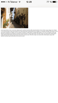
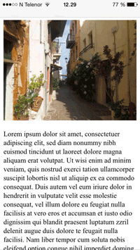
如果将 width 属性设置为百分比,而 height 属性设置为 auto,图像就会响应并上下缩放。
img {
  width: 100%;
  height: auto;
}
<!DOCTYPE html>
<html>
  <head>
    <meta name="viewport" content="width=device-width, initial-scale=1.0" />
    <style>
      img {
        width: 100%;
        height: auto;
      }
    </style>
  </head>
  <body>
    <img
      src="https://raw.githubusercontent.com/dribble-njr/typora-njr/master/img/20240229124038.png"
      width="460"
      height="345"
    />
    <p>Resize the browser window to see how the image will scale.</p>
  </body>
</html>
注意
在上面的示例中,图片可以按比例放大到比原始尺寸更大。在许多情况下,更好的解决方案是使用 max-width 属性。
使用 max-width 属性
如果 max-width 属性设置为 100%,图片会在必要时缩小,但绝不会放大到大于原始尺寸:
img {
  max-width: 100%;
  height: auto;
}
背景图片
背景图片还可以对大小和比例进行调整。
- 如果
background-size属性设置为contain,背景图片就会缩放,并尽量适应内容区域。不过,图像将保持其宽高比(图像宽度和高度之间的比例关系):
<!DOCTYPE html>
<html>
  <head>
    <meta name="viewport" content="width=device-width, initial-scale=1.0" />
    <style>
      .div {
        width: 100%;
        height: 400px;
        background-image: url('https://www.w3schools.com/css/img_flowers.jpg');
        background-repeat: no-repeat;
        background-size: contain;
        border: 1px solid red;
      }
    </style>
  </head>
  <body>
    <p>Resize the browser window to see the effect.</p>

    <div class="div"></div>
  </body>
</html>
- 如果
background-size属性设置为100% 100%,背景图片就会拉伸以覆盖整个内容区域:
<!DOCTYPE html>
<html>
  <head>
    <meta name="viewport" content="width=device-width, initial-scale=1.0" />
    <style>
      .div {
        width: 100%;
        height: 400px;
        background-image: url('https://www.w3schools.com/css/img_flowers.jpg');
        background-repeat: no-repeat;
        background-size: 100% 100%;
        border: 1px solid red;
      }
    </style>
  </head>
  <body>
    <p>Resize the browser window to see the effect.</p>

    <div class="div"></div>
  </body>
</html>
- 如果
background-size属性设置为cover,背景图片将按比例覆盖整个内容区域。请注意,cover将保持纵横比,背景图片的某些部分可能会被剪切:
<!DOCTYPE html>
<html>
  <head>
    <meta name="viewport" content="width=device-width, initial-scale=1.0" />
    <style>
      .div {
        width: 100%;
        height: 400px;
        background-image: url('https://www.w3schools.com/css/img_flowers.jpg');
        background-repeat: no-repeat;
        background-size: cover;
        border: 1px solid red;
      }
    </style>
  </head>
  <body>
    <p>Resize the browser window to see the effect.</p>

    <div class="div"></div>
  </body>
</html>
不同设备使用不同图像
大尺寸图片在电脑大屏幕上可能非常完美,但在小设备上却毫无用处。既然要缩小图片,为什么还要加载大图片呢?为了减少加载或出于其他原因,您可以使用媒体查询在不同设备上显示不同的图片。
下面是将在不同设备上显示的一张大图和一张小图:
/* For width smaller than 400px: */
body {
  background-image: url('img_smallflower.jpg');
}

/* For width 400px and larger: */
@media only screen and (min-width: 400px) {
  body {
    background-image: url('img_flowers.jpg');
  }
}
可以使用媒体查询 min-device-width 代替 min-width,后者检查的是设备宽度,而不是浏览器宽度。这样,当调整浏览器窗口大小时,图片就不会改变:
/* For devices smaller than 400px: */
body {
  background-image: url('img_smallflower.jpg');
}

/* For devices 400px and larger: */
@media only screen and (min-device-width: 400px) {
  body {
    background-image: url('img_flowers.jpg');
  }
}
HTML <picture> 元素
HTML <picture> 元素为网络开发人员指定图像资源提供了更大的灵活性。
<picture> 元素最常用于响应式设计中使用的图像。与根据视口宽度放大或缩小一张图片的做法不同,可以设计多张图片,以便更好地填充浏览器视口。
<picture> 元素的工作原理与 <video> 和 <audio> 元素类似。可以设置不同的来源,符合偏好的第一个来源就是正在使用的来源:
<picture>
  <source srcset="img_small_flower.jpg" media="(max-width: 400px)">
  <source srcset="img_flowers.jpg">
  <img src="img_flowers.jpg" alt="Flowers">
</picture>
srcset 属性为必填项,用于定义图像的来源。
media 属性是可选属性,可接受 CSS @media 规则中的媒体查询。
还应为不支持 <picture> 元素的浏览器定义 <img> 元素。
响应式视频
使用 width 属性
如果将 width 属性设置为 100%,视频播放器就会响应并上下缩放:
video {
  width: 100%;
  height: auto;
}
使用 max-width 属性
和 响应式图片 一样,最好使用 max-width 属性,视频会在必要时缩小,但绝不会放大到大于原始尺寸:
video {
  max-width: 100%;
  height: auto;
}
HTML <video> 元素
<video> 元素的工作原理与 <picture> 元素类似。可以设置不同的来源,符合偏好的第一个来源就是正在使用的来源:
<video width="400" controls>
  <source src="mov_bbb.mp4" type="video/mp4" />
  <source src="mov_bbb.ogg" type="video/ogg" />
  Your browser does not support HTML5 video.
</video>